
Visual Refresh: Keeping QuickBooks Design System Relevant


The Problem
QuickBooks’ design expression was intended to visually enhance content about QuickBooks functionality.
We have observed that we need to stay in sync with marketing, trends, and customer expectations every 3 years.
How might we evaluate QuickBooks’ visual content to ensure it continues to enhance QuickBooks functionality?
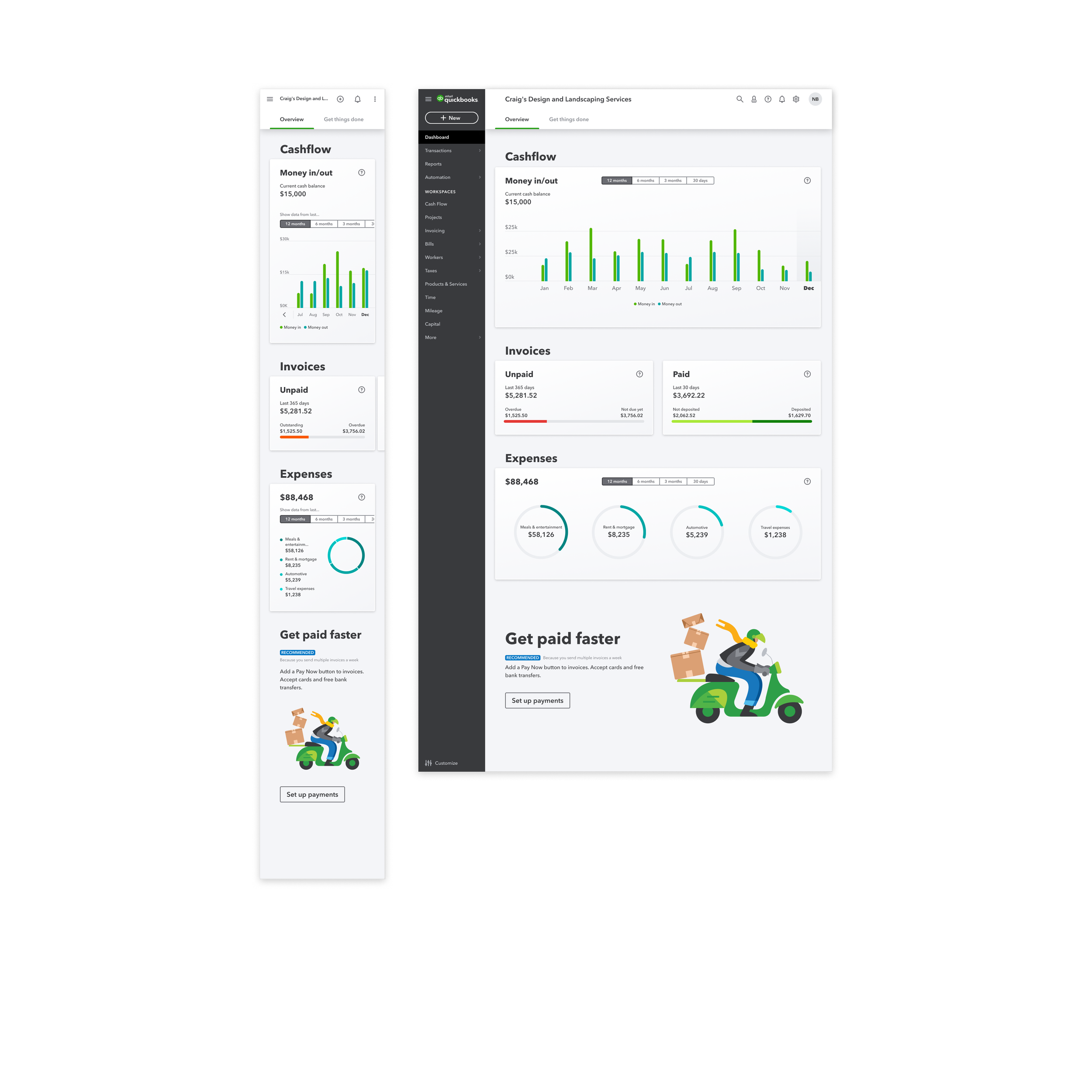
Current Expression Of The Product
My critique of the current expression of the product, and my assessments based on best practices for usability.

Critique 1: Bar Graph Widget

-
Different elements are too close to each other, which makes it more challenging to scan and identify elements in the bar graph.
-
Bar graphs should be simple. Too many lines aren’t needed. Just a few key levels like Low, Mid, and High are enough. Bar graphs are mainly for comparing data and seeing trends, not for exact numbers.
Critique 2: Data Points

-
The data point suffers from a label placement problem, with values placed above the names, making it harder to scan quickly for identification. In North America, we have a reading order bias of left to right or top to bottom.
Critique 3: Pie Charts

-
Comparing slices by angle is less precise than comparing lengths.
-
Our brains find it difficult to compare angles accurately. It’s easier for us to compare lengths or positions on a common scale, like in bar or line charts.
Design Brief:
Spice Up QuickBooks with Varying Degrees of Spiciness
Design and deliver three concepts for the product’s next iteration, categorized as Mild, Medium, and Spicy. Each concept will represent a different level of innovation and customer experience while maintaining the essence of QuickBooks’ brand.
Mild
The Mild concept is the closest to the current product expression. It is an evolution of existing products in QuickBooks, ensuring that it remains recognizable and easy for customers to dive into.
Objective
Provide a familiar and comfortable user experience with subtle improvements.
Visual style
Retain current design elements with minor enhancements to improve usability and aesthetics.
Target audience
Existing customers who appreciate the current design but welcome small, thoughtful updates.


Medium
The Medium concept pushes the boundaries while still retaining the core identity of the current product expression of QuickBooks. This design might cause customers to do a double-take but will quickly become familiar and delightful.
Objective
To introduce noticeable changes that enhance the user experience without alienating current users.
Visual style
Bold but balanced changes that stand out yet remain within the brand’s recognizable framework.
Target audience
Customers open to change and looking for a more engaging and modern experience.


Spicy
The Spicy concept is all about going all out. It is a radical departure from the current product expression, speaking volumes about where we are heading next. This design is confident, delightful, and on fire!
Objective
To showcase a completely new direction that highlights our confidence and willingness to innovate.
Visual style
Vibrant, dynamic, and adventurous design elements that capture attention and spark curiosity.
Target audience
Forward-thinking customers who are excited about bold innovations and new directions.

